
Four Easy Ways to Improve Sticker and Label Designs
It’s not easy to stand out among the crowd, especially when your competitors can spend more money on branding and merchandising than you can. Even larger companies struggle with keeping their image fresh and on point. That’s why rebranding is a big business and is widely discussed in almost every industry.
But what is the drive behind rebranding efforts? It’s an attempt to leverage a new or preexisting angle of a product or service. This is exactly what the best-designed product labels and stickers can offer you!
Here are four easy ways to improve sticker and label designs.
1. Consider Eye-catching Colors
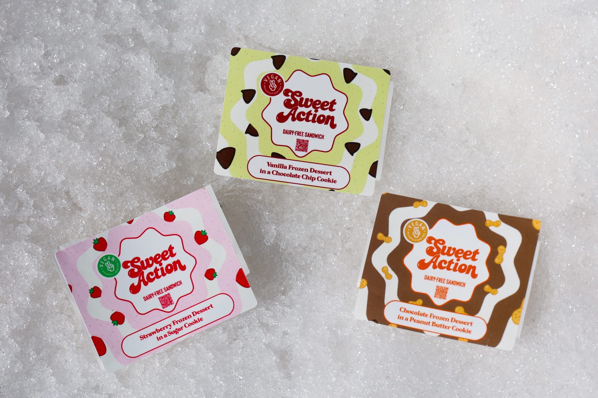
A bright splash of color is a great way to draw a customer to your product. On the other hand, cool, sophisticated black and white, jewel tones, and muted reds are all memorable in their own way. Color is one of the most powerful tools in making stickers pop.
Out of the many different ways to add color to your sticker or label, our top choices are:
- Use bright background colors when appropriate. Shades of red and yellow are especially good. Sticker Mountain’s high-quality presses ensure vibrant colors and sharp designs.
- Leverage color blocking. It can be striking on both large and small stickers, making it a good way to incorporate multiple colors in a tasteful design.
- Consider abstract designs or large patterns in a monochromatic or two-color scheme. At Sticker Mountain, we can layer colors to create new and exciting experiences.
2. Choose words wisely
You have a limited amount of space on any label or sticker. Choosing the wording carefully is a key part of making your space pop. Some particularly strong designs go so far as to use a single word and nothing more.
While that approach is certainly not for everyone, it’s worth considering reducing your word count to the bare minimum. If you must include the required information, consider splitting your labels into front and back labels in order to maximize your viewer’s attention to your image.
3. Streamline your design
Less is always better on a sticker or label. People’s attention spans are getting shorter and shorter, making it hard to keep their eyes on your product. Some easy things to cut on your label or sticker include personal stories, mottos, or other lengthy explanations.
While these have a time and a place, consider showcasing them on a flyer, social media, or your company website instead of your products.
4. Make sure to keep it on brand!
Finally, always stay on brand. Your bright yellow sticker with bold wording may get people to look, but if the rest of your branding and advertising is in cool blue tones with fine, flowing script, it’s going to create dissonance and confusion. Don’t scare potential customers away before they get a chance to meet you and experience your brand.
Work With A Printing Vendor Who Gets You
It’s a good idea to create a few test runs in order to see your designs in action before committing to one design. With these four easy ways to improve sticker and label designs, you really can’t miss a beat. Plus, Sticker Mountain offers beautifully embellished label printing, like foiling, embossing, and raised spot UV label printing, adding that extra touch to make your labels truly stand out.
Finally, when you are ready to make the jump and order your new popping stickers, let Sticker Mountain know! We are ready and willing to help you with anything from a small test batch to your big opening order.