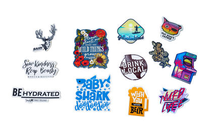
Custom stickers give your brand a fresh and original voice, so starting on the right foot is key to getting more customers through the door! However there are a few common mistakes that can arise when in the design phase. Let’s make your custom sticker sensational by avoiding these five common mistakesto make the most effective and professional stickers!
Problem 1: Low Resolution Art
Sometimes it can be tricky to know the image resolution to upload. Low pixel resolution can lead to various issues with your custom sticker.
It can destroy your entire sticker image because if you use too low of a resolution, your graphics are too pixilated and fuzzy.
This is often the case for orders that are enlarged due to preference or incorrect product measurement. The problem this presents is that our printers are so good at what they do, they will print exactly what you send us, pixelation and all.
Solution!
To avoid the loss in quality for your stickers, make sure you upload your highest resolution possible. The best formats to upload are:
TIF, TIFF, EPS, AI, PSD, BMP, GIF, JPG, PNG, PDF.
For your image resolution, make sure it is 350 dpi at 100% of the final print size, 1/16″ for safe zone away from the trim line, and bleeds 0.1″ This gives you some wiggle room for our lasers, and a high quality image that will print great!
We also recommend creating your designs in CMYK mode if you are using a program such as Adobe Illustrator or Photoshop.
Problem 2: Poor Design Elements
The design of your custom sticker is the ultimate focus because it’s a reflection of your brand. Too many mistakes are made with design elements, so Sticker Mountain has an entire team dedicated to ensuring your custom stickers are flawless. Design elements include:
Poor color choices-
Unfortunately, there is such a thing as poor color choices in design. In addition, choosing opposite on the color wheel can clash and vibrate if you use too similar saturation and brightness. This is not a good effect in the sense that it is very uncomfortable to the eye and can cause after images, such as looking at really bright lights. Choosing these colors affects your custom sticker’s effectiveness in people wanting to share your brand with the world.
Text styles-
Designing your custom sticker takes time and patience (or a very good artist you may know). You often change the font size, style, and colors numerous times before you find the right combination for your brand. Sometimes the text is too small or too large in the wrong places. Text color is critical because using a dark blue text color on a black background makes for an unreadable design. Or, it’s too light for the background and remains invisible.
Incorrect use of negative space-
Negative space is the empty area around a design. Knowing whether to fill or leave the space blank can take time and effort. Either way, the right balance needs to be found, so your sticker doesn’t look blank or overcrowded. If overcrowded, again it makes it hard to read and understand. On the other hand, if there’s too much space in between areas, in can make for an awkward look.
Solution!
For any and all of your stickers, make sure your colors are consistent through all your materials. You can even right a note of the specific HEX, Pantones, or CMYK color numbers in order for it to be exactly how you want them. At Sticker Mountain, we pride ourselves on our color matching skills; if you want to learn more about color in general, check out our series here!
When it comes to your font choice and how it’s used, make sure you choose a font that is easily legible at small and large sizes. Give it enough breathing room, but not too much to where it looks awkward. Though some fonts can be cool, and used for certain cases, take care to choose a font that represents your brand but serves its purpose.
Finally, use negative space wisely! This is mostly considered when placing text anywhere but you can use negative space to your advantage! Think of Fedex’s logo and the arrow hidden in between the e and x. Negative space can be a unique tool to make something very surprising and unforgettable for your customer!
Common Problem 3: Intended Environment
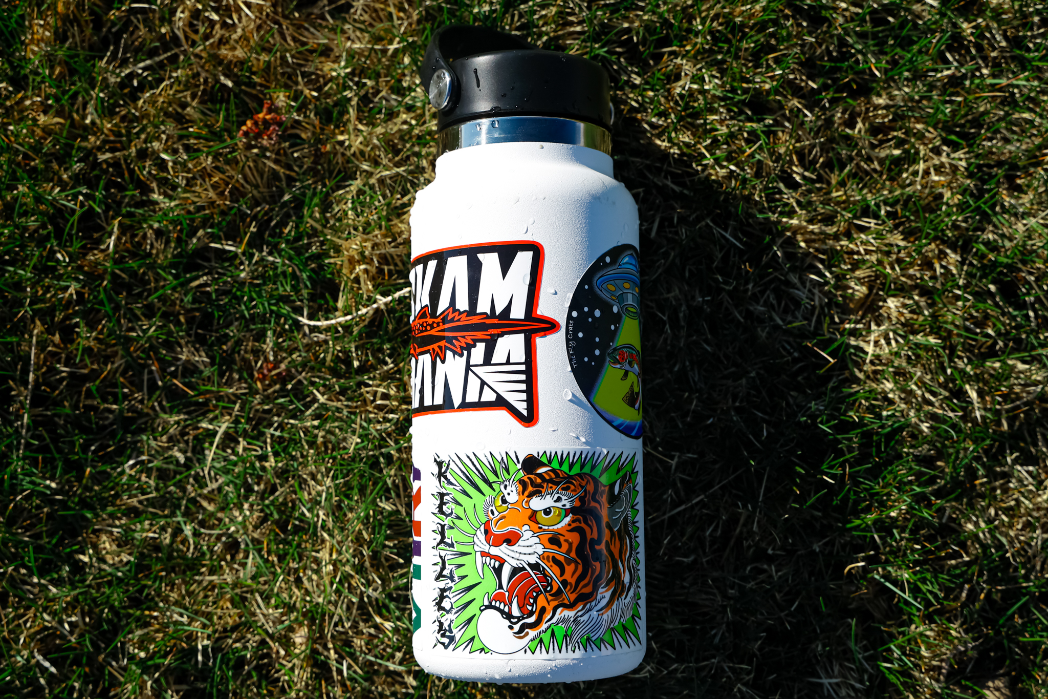
The third common mistake is determining what your stickers are being used for. Is it for a free advertisement to go on cars, coolers, water bottles, etc.? Or is your custom sticker order for product packagings such as foods and beverages? The material you choose can really effect the results you get from where you put it. If you choose a material that isn’t as flexible, it may not sticker to packaging well, however it could be perfect for placing on a car window.
Solution!
Knowing the environment your custom sticker will be enduring, such as weather or freezing temperatures, determines the sticker’s material you choose. Finally, if it’s going to be used as packaging, your best bet is to order a label, which is made with materials that can handle anything your product will go through.
Common Problem 4: Grammar
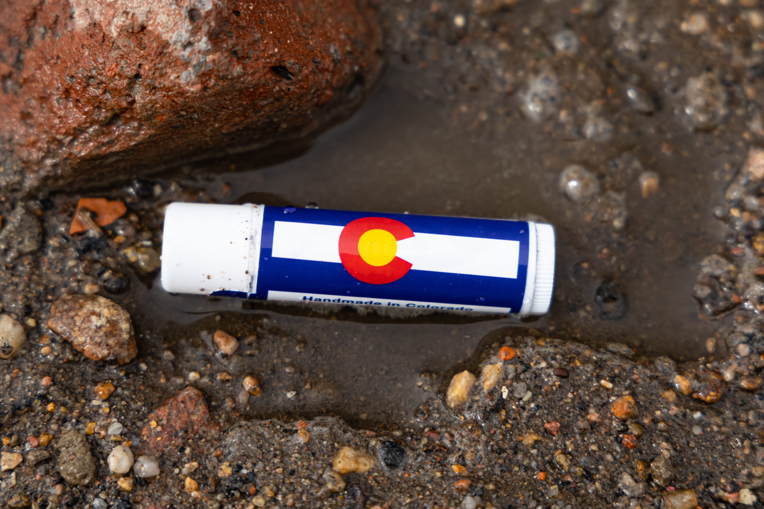
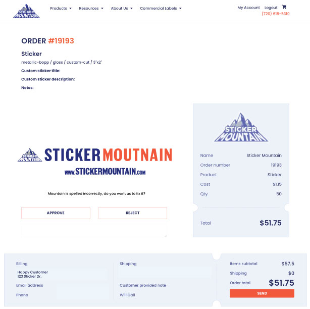
Careless errors on your custom sticker will undermine your brand and devalue it tremendously. While people think it’s easy to have correct grammar, sometimes small mistakes can slip through the cracks. It’s something can be so little, but really loses the trust in the customers purchasing your product.
Solution!
Avoid this common mistake by giving a final look at your custom sticker artwork. You can even use spell checkers, or all your important texts in such programs like Microsoft Word or Grammarly. At Sticker Mountain, we have a system in place where multiple people look over each sticker design to look for the simplest errors. So even if you may miss something, we’ve got experts that will reach back out to you regarding spelling errors.
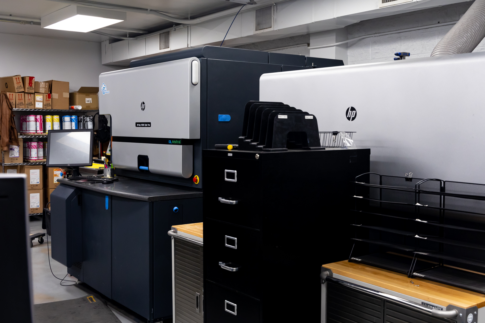
Common Problem 5: Printer Quality
The fifth common mistake people make when making their custom labels is thinking cheaper is better. Some people resort to more inexpensive printing styles, such as inkjet printers. While cheaper might be more convenient, the outcome will not be great. In the end, you spend more money in the long run because cheaper labels will not last and do not look professional.
Solution!
Committing to a professional printing company will show your customers you take your brand seriously and invest in your company. Plus, it’s not as expensive as you may think! At Sticker Mountain, you can order as little as 50 stickers for around a dollar a sticker (don’t worry, as you add larger quantities, price per sticker drops significantly *and it all depends on a few things, which you can learn more here). At the end of the day, the best thing for you to do is avoid printing cheap labels if you want to avoid devaluing your brand.
Above all, Sticker Mountain has your back! You can avoid making these five mistakes by choosing a professional printing company like ours. We’ll help you through the hard times and celebrate with you in the good times. Sticker Mountain’s quality of custom-printed stickers will bring your company to the next level. Our art department includes experienced and friendly graphic designers. If you’re still unsure and have more questions, visit our FAQ page or send us your questions here.
Random Fact of the Day
Did you know a dog’s nose has over 300 million receptors? A human has about 5 million. No wonder why dogs have such a good sense of smell!